-
A-Logo

-
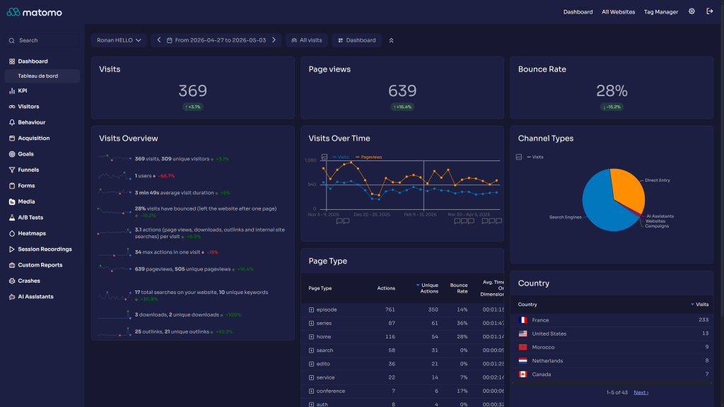
Dashboard
-
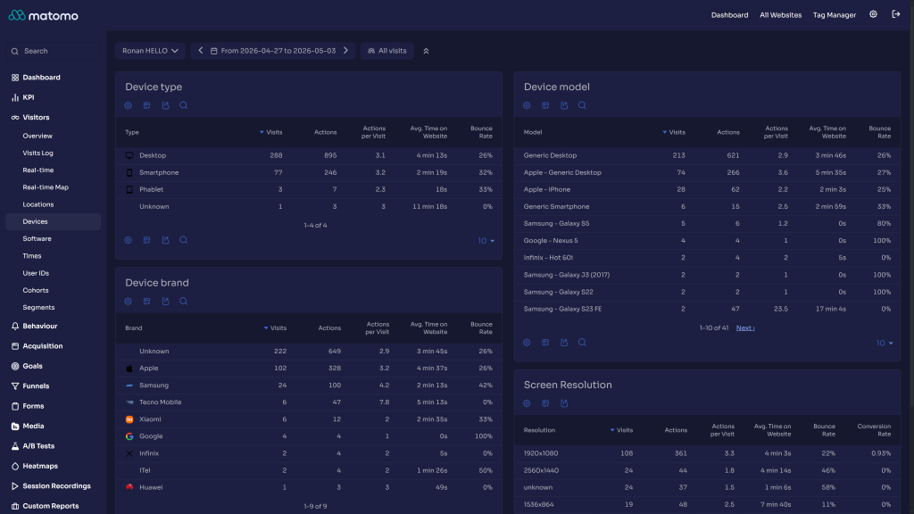
Devices
-
Visits logs
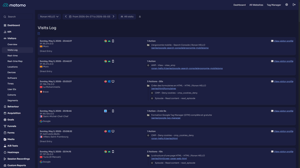
The Openmost Theme converts the Matomo interface to match the Openmost design system. It plugs into Matomo's native theming engine to define a complete light and dark palette, then layers a few component-level LESS tweaks on top.
Design system
Both palettes follow the Openmost website: the same Openmost blue accent, white cards on a soft background in light mode, and brand navy cards on a deep page background in dark mode.
Token Light Dark Brand#426CDA
#7A96E8
Background base
#F5F6FA
#0A0B1A
Surface (widgets, header)
#FFFFFF
#161830
Surface hover
#ECEFF8
#1A1C38
Text primary
#1C1F41
#FFFFFF
Text secondary
#4A5169
rgba(255, 255, 255, 0.87)
Border
#E5E7F0
#282A4B
Chart base
#F84B5C
#F84B5C
Typography: Sora for headings (page, report and widget titles), shipped with the plugin as a variable font under the SIL Open Font License. Text uses the system font.
File structure
OpenmostTheme/
├── OpenmostTheme.php          # Registers theme variables (light + dark pairs)
├── plugin.json                # Matomo metadata, requires Matomo 6
├── fonts/Sora/                # Sora variable font and its license
├── stylesheets/
│   ├── theme.less             # Entry point, imports everything
│   ├── _fonts.less            # @font-face declaration for Sora
│   ├── layout/
│   │   ├── _main.less         # Scrollbar styling
│   │   └── _typography.less   # Sora headings
│   ├── pages/
│   │   └── _login.less        # Login screen tweaks
│   └── components/            # One file per overridden component
└── docs/                      # This documentation
How theming works
Matomo ships a Plugin\ThemeStyles class with one property per theme color. Every property accepts either a single string or a [light, dark] array: Matomo emits the right CSS variable for each mode and switches through data-theme-mode plus prefers-color-scheme for users who picked Match browser.
OpenmostTheme.php listens to the Theme.configureThemeVariables event and assigns [light, dark] pairs for every relevant property. The CSS files in stylesheets/components/ consume those tokens with var(--theme-color-*), so the same component definition works in both modes.
Overridden components
Component overrides live in stylesheets/components/:
- Activity log, admin pages, alerts, copy-to-clipboard
- Custom reports, entity lists, funnels
- Form inputs, jqPlot charts, multi-sites
- Notifications, period selector, scheduled reports
- Segment editor, sidebar, tag manager
- Visitor profile, visits log, widgets
Each file is intentionally small: the goal is a minimal diff against Matomo defaults.
Customizing the theme
You don't need to fork the plugin to tweak it. Override any --theme-color-* variable in a small companion plugin:
:root {
  --theme-color-brand: #00b4d8;
}

[data-theme-mode="dark"] {
  --theme-color-background-base: #0b0d24;
}
Contributing
Contributions are welcome. Keep changes scoped to one component per file and prefer var(--theme-color-*) over hard-coded hex values so your edits keep working in both light and dark modes.
How do I install this theme?
Open your Matomo administration panel, go to Marketplace, filter by Themes, search for Openmost Theme, install and activate it. A theme applies to the whole Matomo instance.
Which Matomo versions are supported?
- Openmost Theme 6.x supports Matomo 6.
- Openmost Theme 5.1.x supports Matomo 5.10 or newer.
Does it work with light mode?
Yes. The plugin defines a full light palette and a full dark palette. Each user picks Light, Dark or Match browser in their personal settings; Match browser follows the operating system, so users can move between modes without changing settings.
Will all users in my Matomo instance see this theme?
Yes. Once activated, every user sees the Openmost Theme, in the light or dark mode they picked.
Can I customize the colors?
Yes. Every color is exposed as a Matomo --theme-color-* CSS variable. Override any of them in a small companion plugin. See docs/index.md for examples.
Does this theme add any features or change Matomo's HTML?
No. The theme is purely visual. It defines theme variables and adds CSS: it does not modify Matomo's HTML structure, JavaScript, or behavior. That keeps it compatible with every other Matomo plugin.
Does the theme load fonts from an external service?
No. Sora is bundled with the theme and served from your own Matomo instance, under the SIL Open Font License.
How can I contribute?
- Fork the repository, make your change in a small focused commit, and open a pull request.
- Or open an issue describing the problem or proposal.
- Email ronan@openmost.com for anything that doesn't fit GitHub.
How long will this theme be maintained?
It's used in production by Openmost and on every Matomo instance the team operates, so it follows Matomo's own release cadence as closely as possible. Security and compatibility fixes are prioritized.
I want a custom theme for my brand. Can you build one?
Yes. Openmost is a Matomo agency and builds custom themes and plugins for clients. Get in touch at https://openmost.com.
View and download this plugin for a specific Matomo version:
- Matomo 5.x
- Matomo 6.x (currently selected)